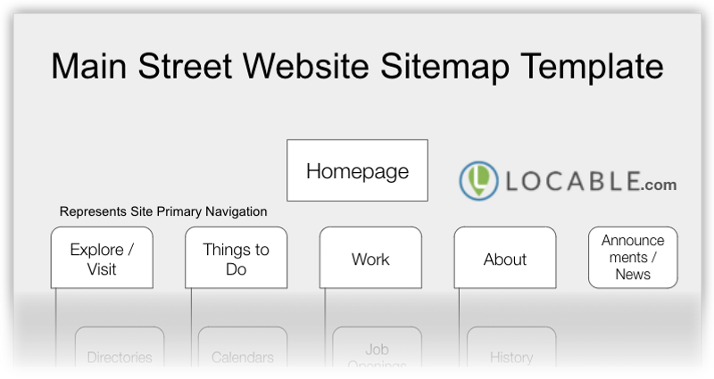
Your Main Street or Downtown website should have these pages and structure (Download)

Over the last few years, we've built some 60 Main Street and Downtown websites - most were tied to our Community-Wide Initiative program - and we've learned a few things along the way.
We're constantly on a quest to simplify every aspect of local marketing with software and our Marketing 3-4-5™ approach such as:
- our popular self-updating Community calendar
- creating content quickly with a Guided prompt-based approach
- making email marketing painless with Express Email Newsletter
- our new Membership Management CRM features
- not to mention our 4-part Marketing Main Street webinar series
Now we're sharing a simple approach to ensuring your website is sufficiently comprehensive to provide value as a resources to locals, visitors, and businesses alike.

Your homepage should largely mimic your top-level navigation
While some visitors to your website will use your navbar many others will scroll down the pages browsing.
As a result, your homepage should be viewed as a second way for people to choose their own adventures.
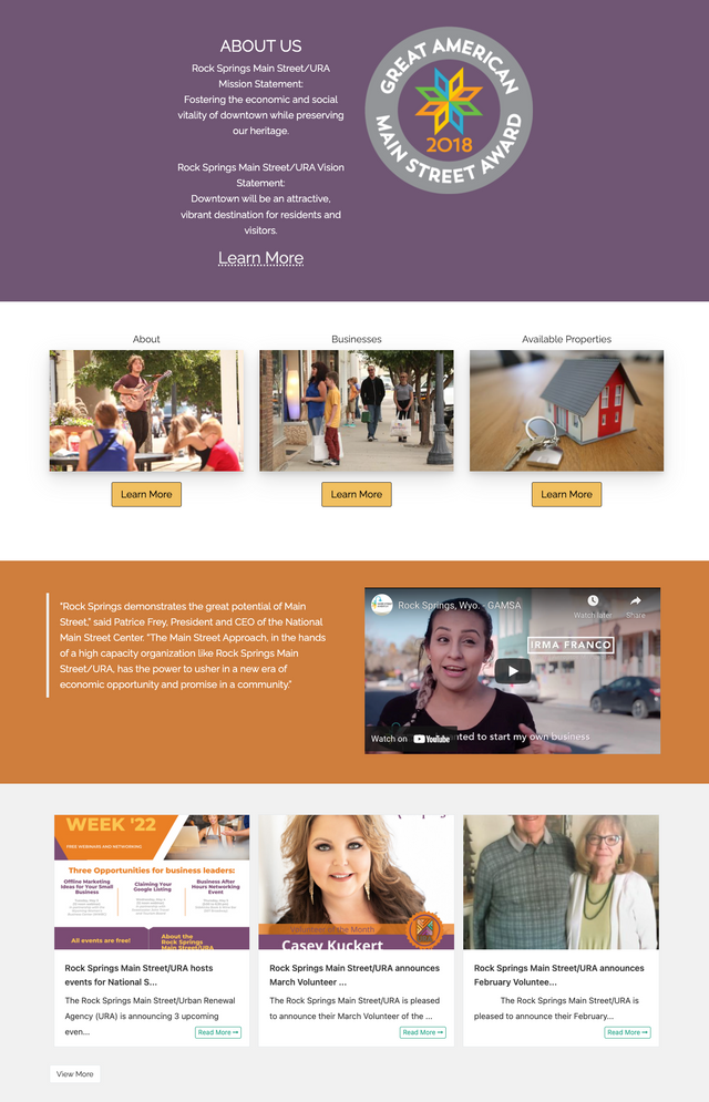
Your navbar should include a link to local businesses, events, and information about your organization and your homepage should include this too along with representative images. You'll also want to show a preview of recent news, projects, etc. to facilitate discovery.
Screenshot of https://www.downtownrs.com/
Making your website your own with this as a starting point
The approach we're sharing here and that we use when setting up websites is a guide - a framework - so you can avoid having to start from scratch.It's NOT the only option or the exact approach you should use.
Some of the labels should be adjusted to match your brand and area of focus. Some of the suggested pages don't apply while you may have other pages that should be added. It's also likely you'll want to reorder some of the dropdown menus to best suit your purposes.
This is meant to be a starting point to save you time in your efforts and can be used to evaluate your current website for needed adjustments or additions.
You can see further website recommendations with our website breakdown video series as well as our local website guide and checklist and our step-by-step small business marketing guide & checklist.
Also, as a family that's traveled to hundreds of communities over the last few years we've found many are not friendly to travelers. This post provides some suggestions on how your community can be more welcoming to travelers, RVers, and others - not to mention encouraging them to visit and spend money.
Remember, this helps provide structure to your website not just your navigation.
A prompt based approach
Once you know the pages you want to include on your website you can identify which photos you need - we make some suggestions for the local pictures you'll need for your website here.
You also have a starting point for other content and marketing copy.
When we do a website, just like Guided Blogging, we provide prompts so it's fast and easy to generate content from the information you already have so if you're looking for a hand go ahead and reach out to us.
A note on the download
You'll find our recommended navigation structure for your website.
Most of the main navigation options are actually Dropdown Labels with pages underneath except Announcements / News which represents some of your blog posts and articles - the shapes in the download reflect this.


