Creating a Good Homepage Design for a Good First Impression

As a business, first impressions are an important part of acquiring new clients and, more often than not, your website's homepage is the very first thing a potential client see's. So, here are a few simple things that every business should do to create a clear and intriguing homepage.
1. Make sure your contact info is easy to find.
Though this may seem obvious, it's often something that tends to get overlooked. Make sure that your homepage has your contact information, and that it's easy to find. This includes email, phone number, and address, as well as social media links. All of these need to be visible and clear on your homepage. You don't want the client to have to go digging for this information or you might lose them before they even get started!
2. Email newsletters.
Collecting email addresses is one of the easiest ways to grow sales. Make sure that it is easy to find the sign-up form and make sure to offer them something in exchange for their email like a discount or ebook that answers a common question. Don't miss the opportunity to build your email list by not including this prominently on the homepage. Click here to view another popular way to build your email list.
3. Clear navigation.
Having a clear navigation bar is not only nicer to look at, but also makes it easier for visitors to find their way around your site. You want clarity and accessibility. Think about what your visitors are looking to answer when they visit your site and use that as your main navigation links across the top of your site. It's also best practice to collapse your navigation on mobile, so if your navigation is taking up the entire screen you might want to check out our web builder which is mobile optimized out of the box.
4. Have images that showcase who you are.
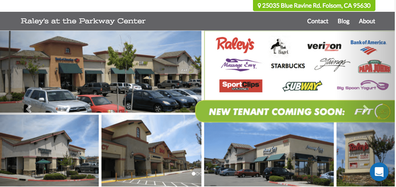
On your homepage, having a few photos that show visitors who you are can help elicit positive emotions. Though it is a simple addition, adding a personal touch to your front page draws in visitors and adds relevance to your homepage. This could be a picture of your store, your team or even a work vehicle.
5. Include a Call-to-Action (CTA)
Make sure to include a CTA for the one action you want people to take, such as Schedule an Appointment, Request a Free Consultation, Get Our Latests Specials, Download Our eBook and so on. This gives your potential client an easy way to get to know you before making a purchase decision which is super important for those not ready to buy.


