Blog-Post Breakdown - Susquehanna Greenway - Good Local Resource Article with Links, Incorporate Visuals and Sharing

Once a business or nonprofit has embraced the importance of creating content aka blogging or posting articles, the next step is to optimize those posts.
This video highlights some low-hanging fruit to improve the effectiveness and reach of the content, I'd recommend that you download our free Content Marketing Guide and Social Media Checklist which can help you get your posting dialed in.
If you're unclear why posting to your website as opposed to just throwing posts on social media, be sure to watch our video explaining the optimal way to post and share content for small businesses.
A Note on Search Engine Optimization
We didn't cover SEO in this video and didn't attempt to create the content itself. Be sure to imporate phrases you think the content should rank for.
Another way to think of it, if there are questions people may ask Google that your content can answer, you should include those questions along with the answer.
Video Transcription
Hello, Brian Ostrovsky here with Locable. It's been a few weeks since we did our last website breakdown video and today we're going to do a breakdown of an individual blog post or article.
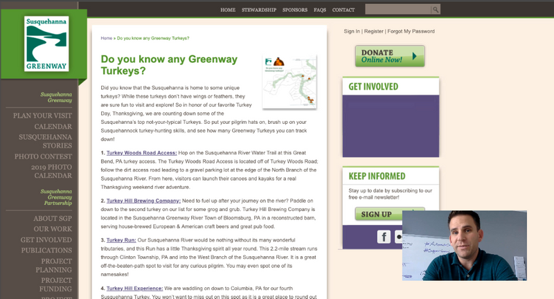
Now, this came about from a conversation I had with the folks at Susquehanna Greenway, they were looking for ways to take what they're already doing and make it more effective. So, I'm going to show you a few things I would recommend.
What they do well with their post
First, I love the fact that they are in fact posting articles and blog posts.
Second, I love the fact that they are linking out. This is really showing love to these organizations but it's also relevant to readers who want to learn more.
And, third, it's great that they're using the narrow columns. If you've watched any of my prior videos we don't want them to go all the way across the screen. We want them to be readable. This is on the narrower end but quite good.
To the things I would recommend improving in their post...
First, the title.
It's a very cute title but also a little confusing. I don't exactly know what it means, but Google definitely won't know what means so something more verbose and specific about what the context is would be great.
It also will affect the URL of the page which is very important and then when people share it to Facebook and they see it in their newsfeed it will help them understand what they are actually seeing.
Images tap into emotion and catch your reader's attention
The second thing is that it would be great to have a big large visual here. Greenway and turkeys both elicit visuals but it'd be great to see it and perhaps even a visual for each location referenced.
In terms of the image that is here, it is in fact a very small thumbnail which isn't great for sharing to Facebook. But, in fact, no og-image is even being defined. Which means, when it shares to Facebook it's just text which unfortunately probably doesn't get a lot of engagement.
In terms of the actual post itself, I would definitely recommend breaking up some of these into shorter paragraphs. Make it easier to scan, perhaps add more bullets you could even format these titles into larger headings.
Definitely use larger fonts, readability is more important now than ever with mobile phones and so larger more readable and scannable fonts would go along way in helping people digest that.
When you look at this, there are no actual sharing icons. So for me to share it to Facebook or Twitter I have to literally copy the URL and paste it. Which is doable but more work which means you're missing opportunities there.
Finally, as I scroll to the bottom. I love the rhetorical question and use of a hashtag but I'd love to see this actually be a call to action.
Post this to Facebook. Follow our page. Maybe, subscribe to our email newsletter to see upcoming updates. Even a download for a map or something related to this would be a great way to continue the conversation.
These are a few great ways to enhance this without much more work but to get more out of it.
Ready to add a "blog" to your website or want a website that comes packed with powerful local marketing tools?
Contact us for a free consultation to learn more about Locable's Marketing Platform and Programs


